
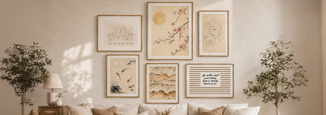
Many gallery walls start with a great idea but end up with slightly crooked frames and the feeling that something just doesn’t look quite right. Most of the time, it’s not about your taste—it’s because you started with the nail instead of the plan.
Start with the Planning, Not the Nail
One of the most common mistakes is starting at the wall. You pick out three prints or frames you like, hold them up, and decide where they should go as you go along. The result is often an unbalanced arrangement that’s difficult to adjust without making additional holes in the wall.
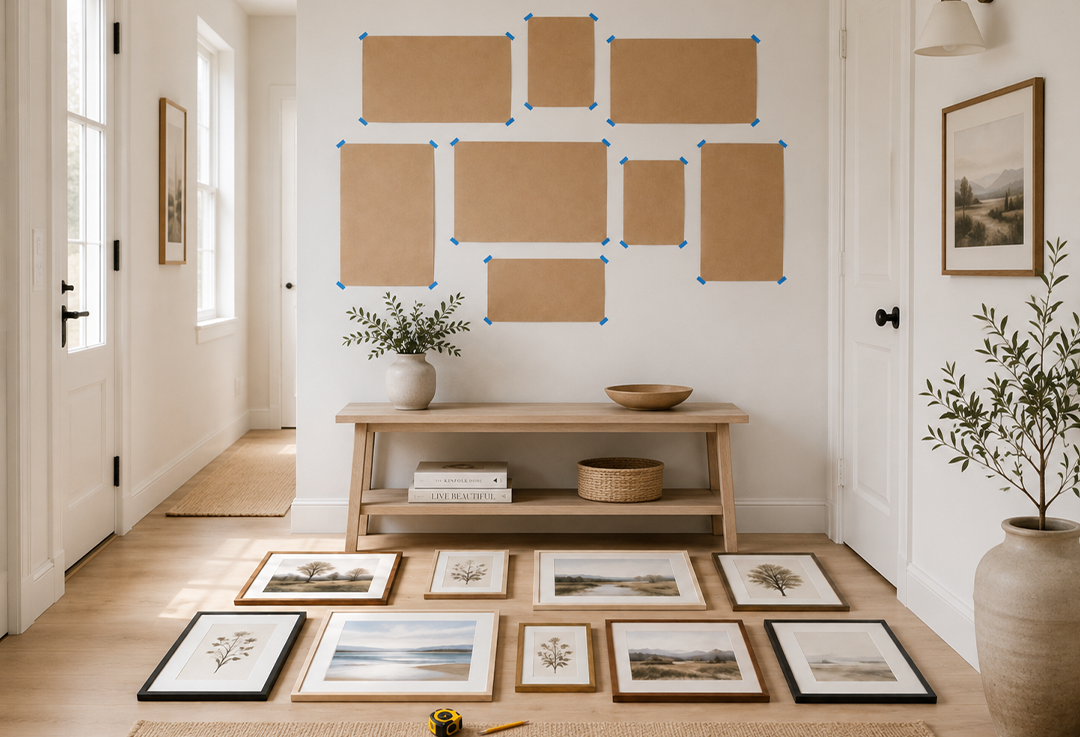
A better approach is to start on the floor. Lay out all the frames and posters exactly as you want them to appear on the wall. Rearrange them until the overall composition feels balanced. It may take a little longer, but it’s the most effective way to visualize the final result before committing to the layout.
Another option is to cut out paper templates that match the size of each frame and tape them to the wall using removable tape. While it requires a bit more preparation, it provides the most accurate preview of how your gallery wall will look before you start hanging anything.
It’s also worth measuring your available wall space early in the process, as well as considering the size of the furniture beneath it. If you're creating a gallery wall above a sofa, the arrangement should be based on the width of the sofa rather than the width of the wall. This creates a more balanced and visually harmonious composition.
Choose a Style, or Mix with a Purpose
There are essentially three classic styles for creating a gallery wall. The first is a symmetrical layout, where frames are the same size and evenly spaced. The second is organized eclecticism, which combines different frame sizes, materials, and layouts without following a strict grid. The third is a themed gallery wall, where the artwork or colour palette creates a cohesive look rather than the frames themselves.
None of these approaches is right or wrong, but it's important to choose one and stay consistent. Mixing a symmetrical layout with an eclectic arrangement on the same wall often makes the display look unplanned and visually cluttered.
Matching Frames or Mixed Frames?
The easiest way to create a cohesive gallery wall is to keep the frames consistent, even if the artwork varies. Using the same frame colour, material, and similar frame widths helps create a clean and harmonious appearance, whether you're displaying photographs, illustrations, or typography prints.
If you prefer mixing different frame styles—which can look fantastic—another element should provide visual consistency. In most cases, this is the colour palette of the artwork. Limiting your selection to two or three dominant colours helps tie the gallery wall together, even when the frame styles and materials differ.
A common mistake is varying both the frames and the artwork without any unifying theme. Even if each individual piece looks great on its own, the overall result can appear busy and disconnected.
Gallery Wall Ideas for Every Room
What works well in a spacious living room doesn't necessarily suit a narrow hallway. The size and function of the room play a significant role in determining the ideal gallery wall layout.
Gallery Wall Above a Sofa
The living room is the most popular place for a gallery wall, with the area above the sofa being the classic choice. This location naturally draws attention and provides plenty of space to showcase your artwork.
Always use the width of the sofa as your reference point rather than the width of the wall or the position of nearby windows. Centre the gallery wall above the sofa, leaving approximately 15–25 cm (6–10 inches) between the top of the sofa backrest and the bottom edge of the lowest frame. This creates comfortable visual spacing while preventing the frames from feeling too low.
For larger walls, fewer oversized pieces often create a stronger visual impact than many smaller frames. Canvas prints or posters in sizes such as 50 × 70 cm or 70 × 100 cm work particularly well. Filling a large wall with numerous small frames can easily make the space feel cluttered rather than balanced.
Bedroom and Hallway
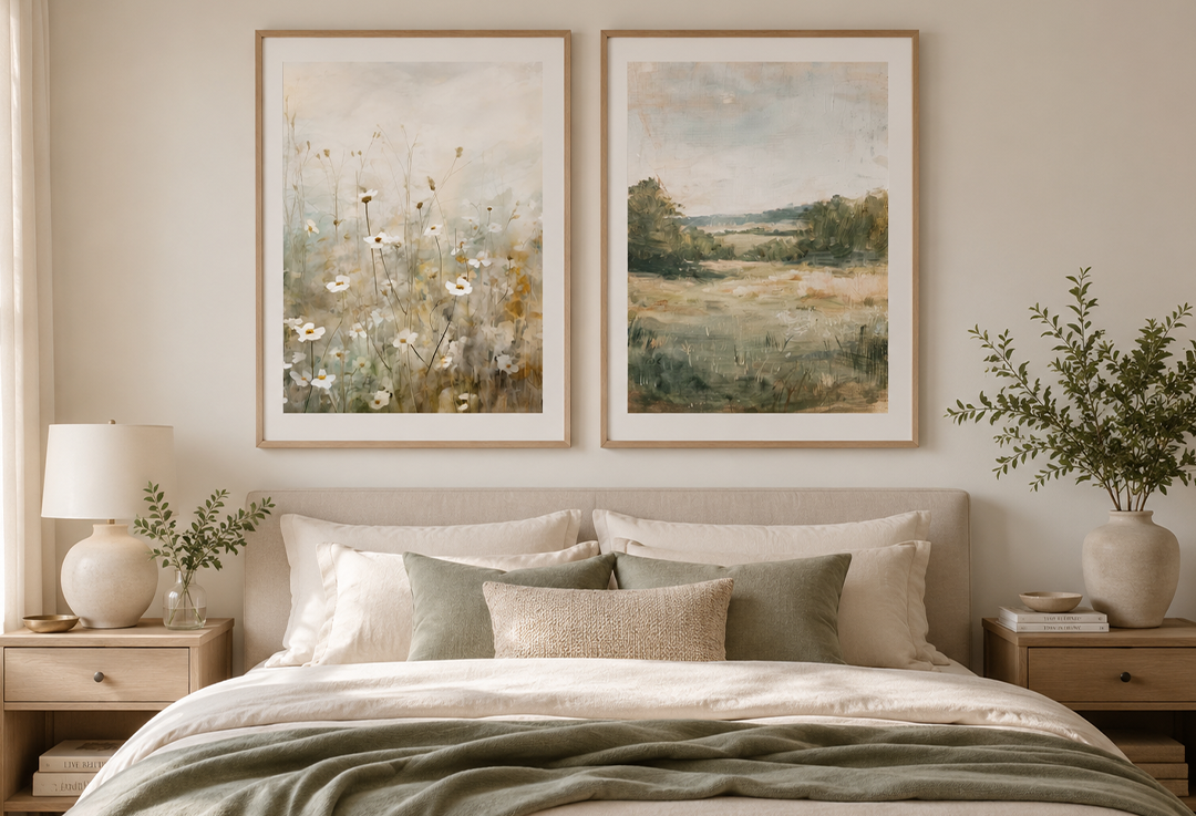
In the bedroom, a calm and symmetrical arrangement usually works better than an eclectic gallery wall. The artwork above the bed is often the last thing you see before falling asleep, so there's rarely a need to make the display overly complicated. Two matching frames with complementary artwork, or a single larger piece, are often enough to create a stylish and relaxing atmosphere.
The hallway presents a different challenge. These spaces are often narrow and tall, making a vertical gallery wall a better choice than a wide arrangement. Another great option is to lean a few framed prints against the wall on a narrow console table or shelf instead of hanging them. This creates a more relaxed look and makes it easy to change the arrangement whenever you like.
A child's bedroom offers the most freedom when it comes to decorating. Here, colour, themes, and personality are often more important than perfect symmetry. There are also many types of removable wall décor that can be updated as your child grows, without having to make new holes in the wall.
Hanging Your Gallery Wall
Once you've planned your layout and chosen your style, it's time to hang your artwork. A few simple tips can make the process much easier.
Always begin with the piece that will act as the focal point—either the largest frame or the one positioned in the centre of the arrangement. From there, work your way outward. Starting with a small frame in a corner often results in a layout that gradually drifts out of balance.
A spirit level is an essential tool rather than an optional extra. It's surprisingly difficult to hang frames perfectly straight without one, especially when creating a symmetrical layout. Taking the time to use a spirit level from the beginning can save you from having to reposition frames later.
For lightweight frames, adhesive picture hooks are an excellent choice and are particularly useful in rented homes because they don't require drilling. Heavier frames, canvas prints, or anything weighing more than one or two kilograms should be mounted using proper picture hooks or screws.
There is no strict rule for spacing between frames, but leaving around 5–10 cm (2–4 inches) between each frame is a good starting point. In smaller rooms, placing the frames closer together creates a more cohesive look. In larger spaces with expansive walls, increasing the spacing gives the arrangement more room to breathe and creates a balanced appearance.